Branding, Logo Design
Case study
Eldorado Dental
Santa Fe, NM
-
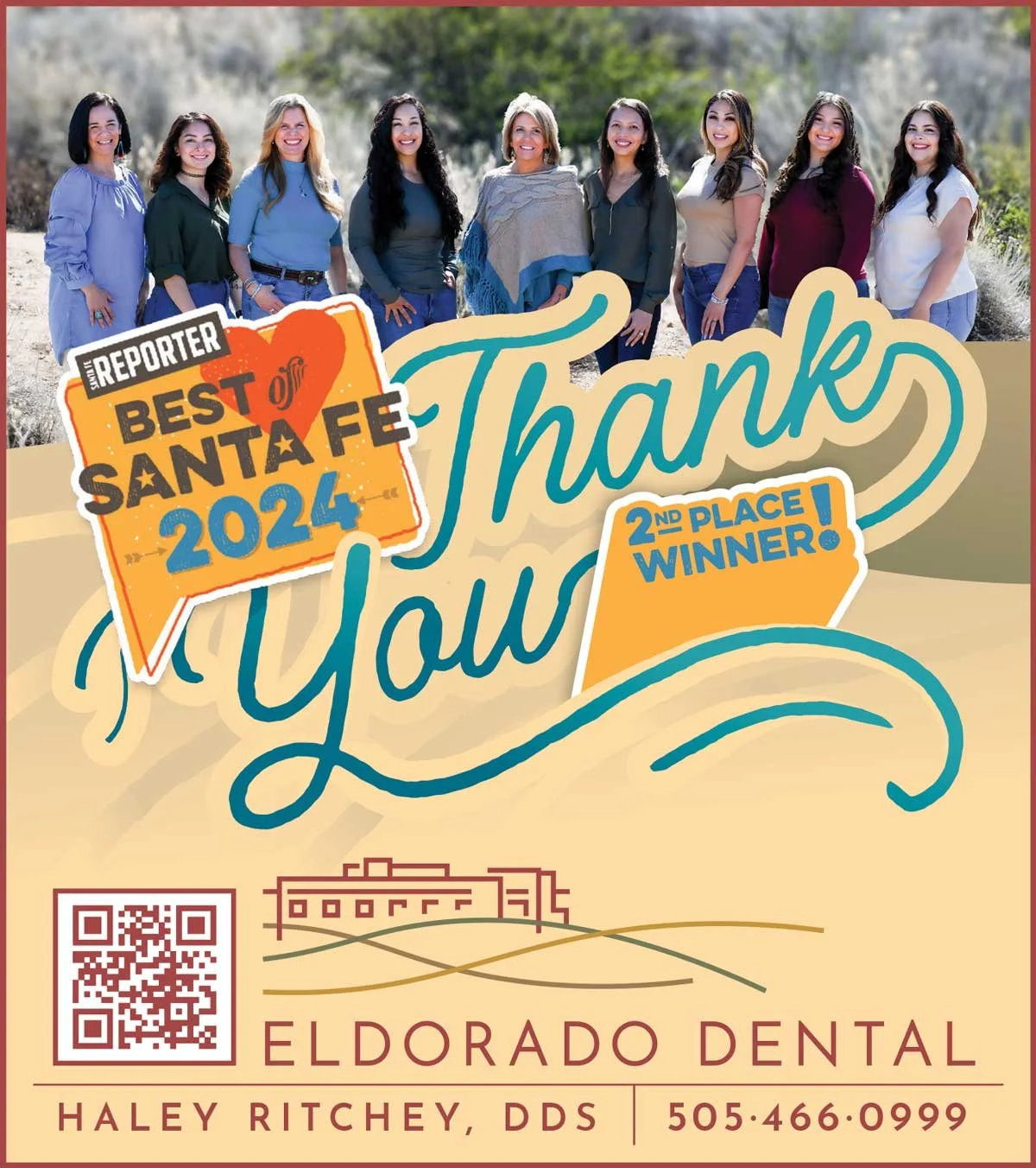
Gatis is an amazing graphic designer. He rebranded my logo and look a few years ago and knocked it out of the park! He is easy to work with and communicates well with anyone who needs my logos or ads. He has designed stationery, business cards, billboards and other print and digital ads for my dental practice. Gatis is professional and down to earth. He is prompt and always delivers on time. I look forward to working with him for the rest of my career. From branding dental practices to designing album covers, this guy can do it all- and do it excellently! He designed my fiancé’s last 3 album covers and they are the best ones yet. If you have the opportunity to work with Gatis, you will be blown away and lucky to work alongside one of the best graphic designers in the industry.
Haley S. Ritchey, DDS
Process
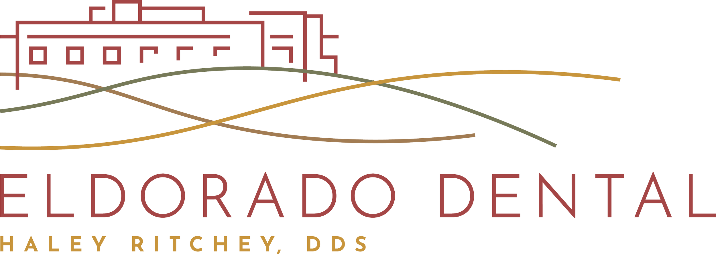
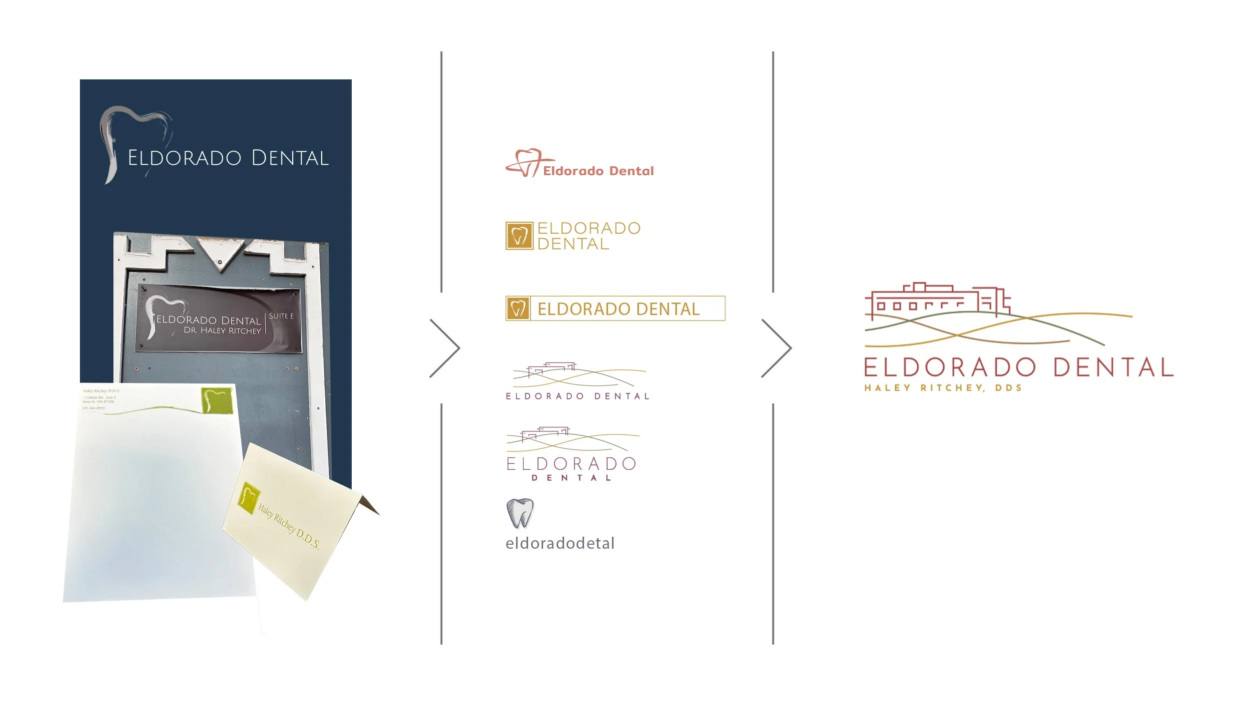
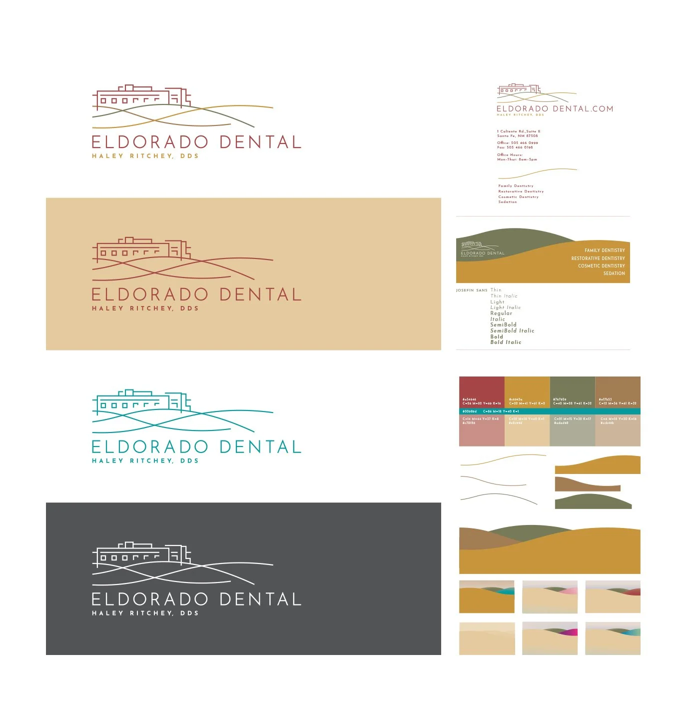
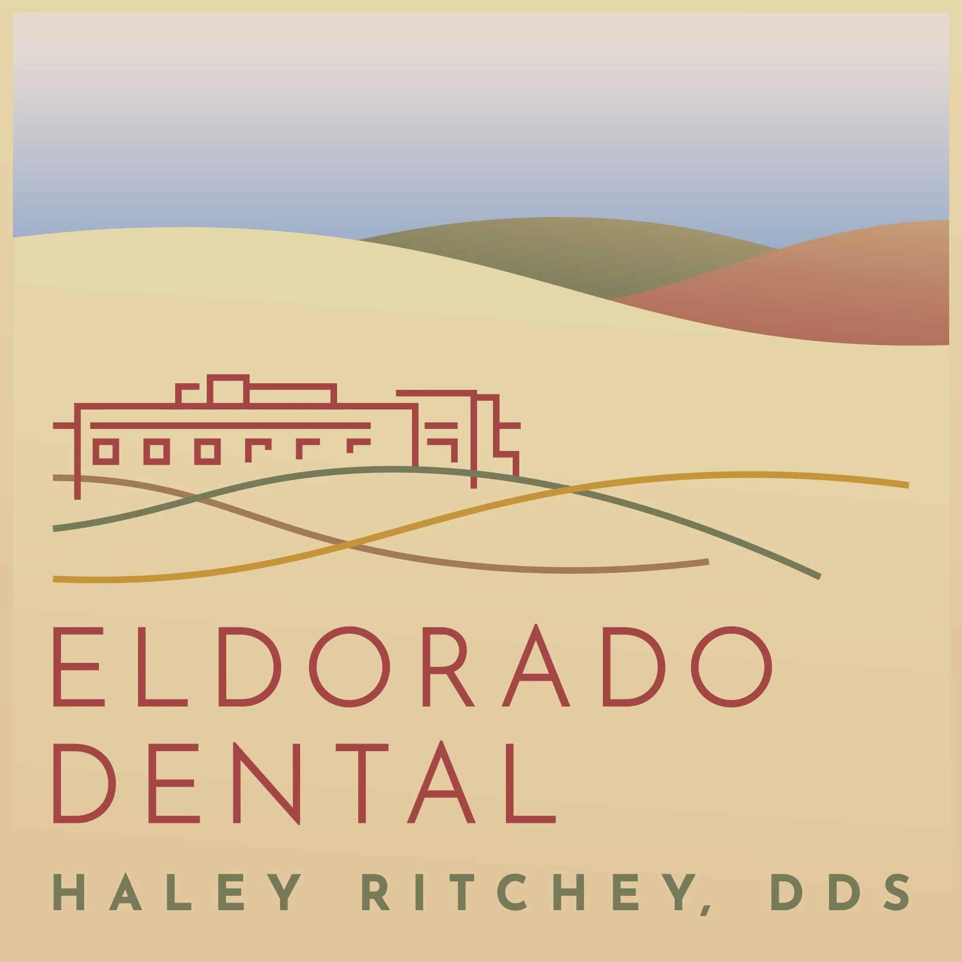
This project began as an update to an existing logo, with the goal of preserving patient recognition. As the work progressed, it naturally evolved into a full rebrand—bringing the practice forward with a more confident, contemporary identity.
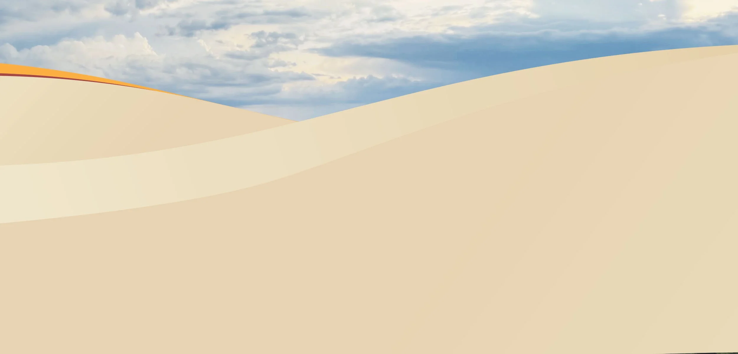
I began by studying the practice, its values, and its setting in Eldorado at Santa Fe. The landscape, architecture, and high-desert palette informed the color system, typography, and overall tone. From there, I refined the logo and built a flexible visual system that could scale—from small print to large-format bus graphics.
Along the Way
I designed and learned about medical promotional materials, ensuring clarity, trust, and compliance while still maintaining strong visual identity.
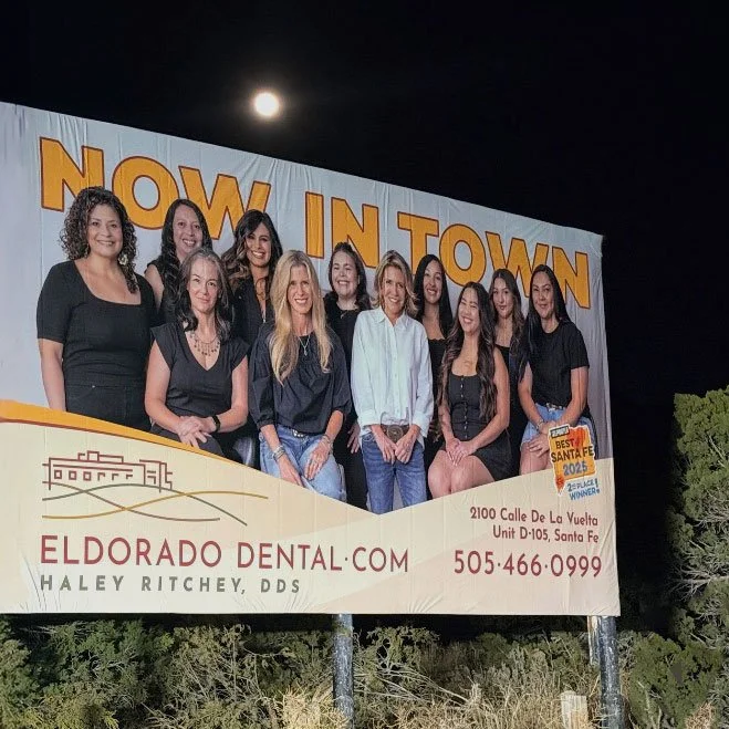
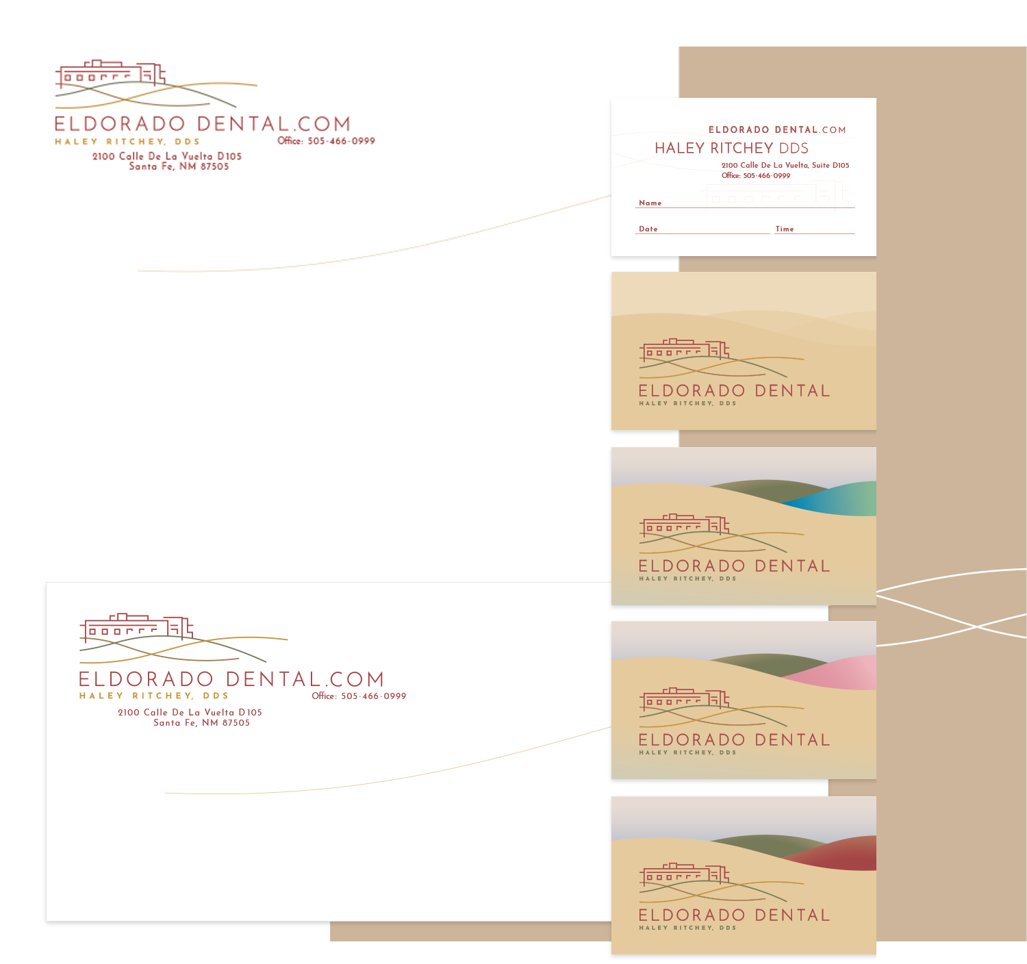
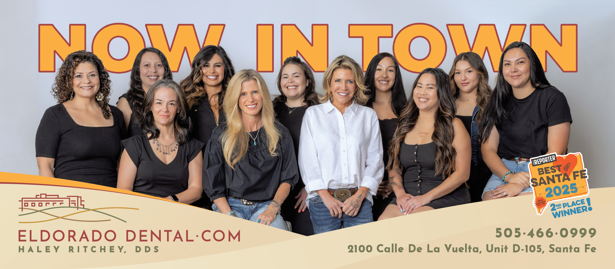
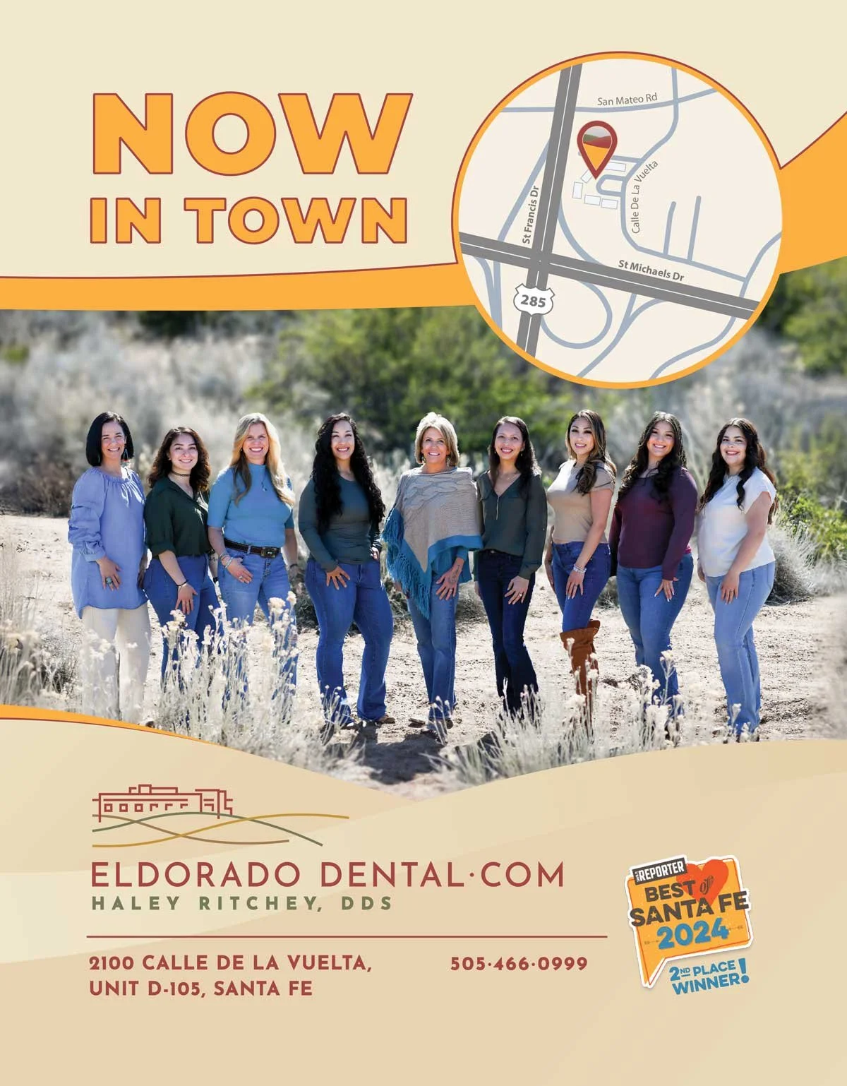
Beyond the logo, this work expanded into full branding and campaign design. I created promotional materials for medical marketing, including print ads, outdoor advertising, and bus wraps, all designed for visibility, readability, and real-world use.
Each application followed clear brand guidelines—consistent color use, typography, spacing, and messaging—so the identity stayed cohesive across every touchpoint. Designing for a medical practice reinforced the importance of precision, calm communication, and patient-focused design.
The buses became moving campaigns: recognizable, professional, and clearly connected to place and practice.
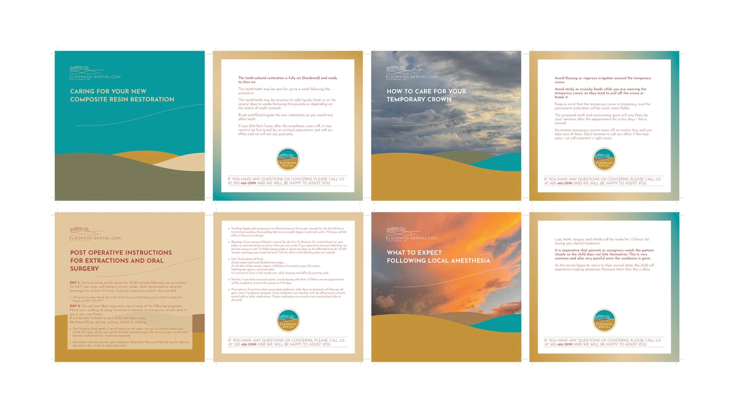
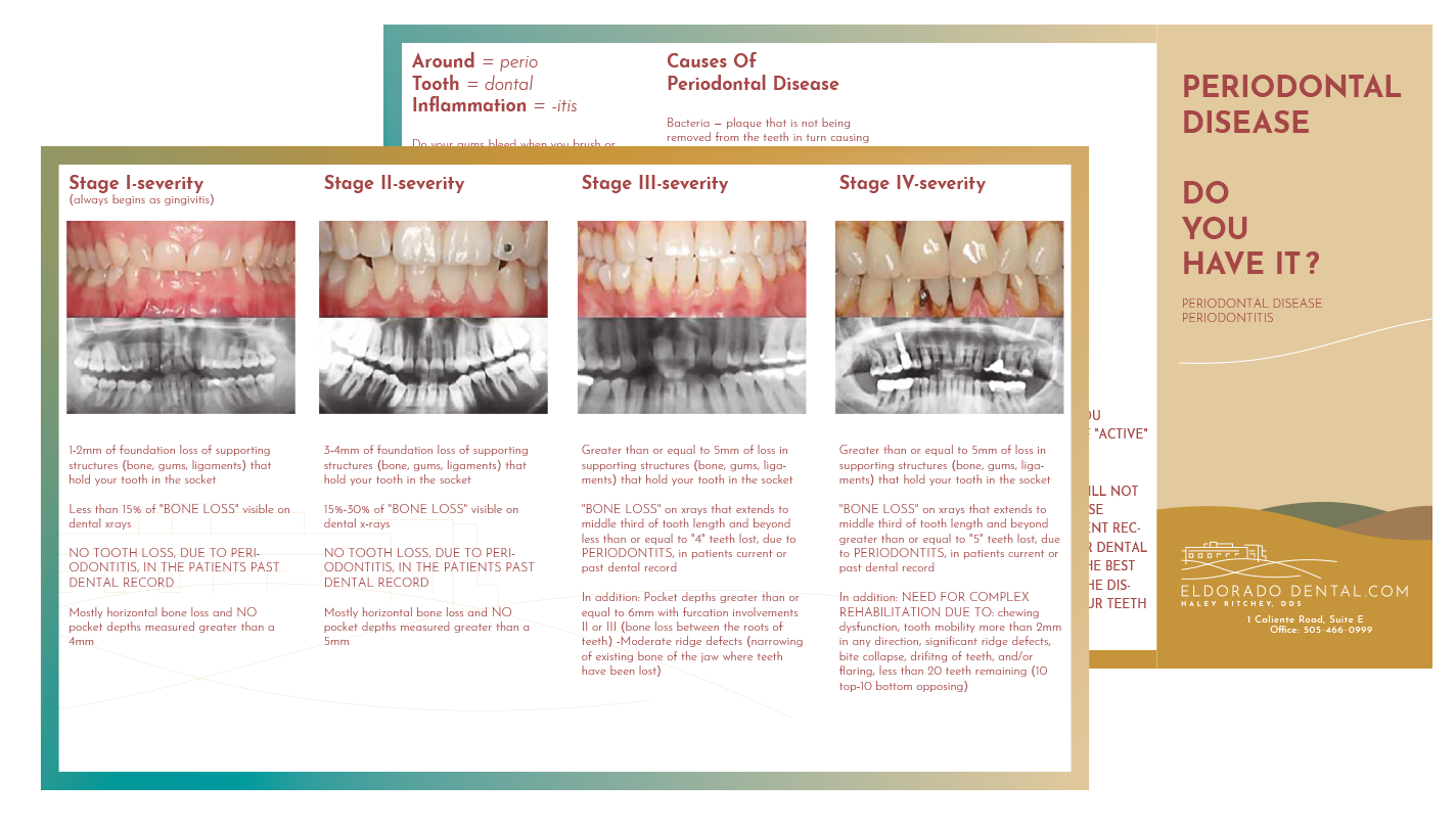
Medical branding requires trust first—design second. Every decision was made to feel approachable, locally grounded, and long-lasting rather than trendy, drawing from the Santa Fe high-desert landscape, architecture, and sense of place.
Through this work, I strengthened my experience in healthcare branding, promotional campaigns while staying true to a human-centered design process.
The final result is a brand that feels established, rooted in its community, and built to grow over time.
“From branding dental practices to designing album covers, this guy can do it all—and do it excellently!”
related
projects
View more projects with a similar scope, approach, and design focus.